 When it comes to website design, fonts can play an important role in defining your brand — and making content easy to read.
The good news is that Google has made it easy to choose from a selection of fonts for your website — and they’re free! They are also “website friendly,” meaning they don’t cause any slowdown when someone visit’s your site.
The problem is, with so many fonts to choose from, how can someone decide what font is right for their brand?
There are a few things to keep in mind that can help …
Serif vs. San Serif Fonts
Serif fonts, like Times Roman, tend to have a more serious feel because of the extra strokes found at the end of the main vertical and horizontal strokes of some letters.
Sans serif fonts, like Helvetica or Arial (Microsoft’s ripoff of Helvetica) are more modern looking. They do NOT have the additional strokes, which makes them more approachable — some would even say more human.
So, a major decision to make is how you want to be perceived as an organization. And while a lawyer’s office or financial planner might want to use a serif font to add a certain gravitas, a hair salon or web design firm will most likely want to use a sans serif font to help them be perceived as modern and approachable.
Google Fonts
If this is your first exposure to even thinking about font style on your website, it may be a good idea to check out Google Fonts yourself. Again there are hundreds of free options to choose from, and they’re good fonts. Once you find one or two that you like, talk with your web design firm, and have them implement for you. The safest way to do this (so actual visitors are not seeing you testing out fonts) is to create a dev site where you can view font selections on your website. It’s VERY easy for a web designer to swap out a Google Font, so you can check out a few options and then implement into your live site once a decision has been made.
Helvetica (the documentary)
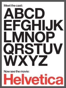
If you want to geek out a little more with fonts, I highly recommend Gary Hustwit’s documentary, Helvetica, which is a great exploration of the Helvetica type face, as well as a primer into the world of typography.
The Visual History of Type
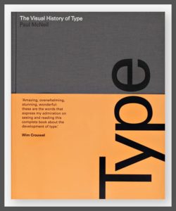
If the film is not enough, or if reading is more your thing, then check out The Visual History of Type, by Paul McNeil. This book is also great for working out as it’s really heavy! It’s also a comprehensive, detailed survey of the major typefaces produced since the advent of printing with movable type in the mid-fifteenth century to the present day. And it’s truly beautiful …
When it comes to web design, fonts are only one part of the equation, but they’re an important one. Being deliberate about font you choose for your website can go a long way in helping clearly define your brand.
That said, which type is your type?
Want more tips and insights from Cuppa SEO?


