 When it comes to web design, your imagery plays a key role in how you are perceived by website visitors.
That said, if you’re creating a new website, or sprucing up your existing site, it’s a good idea to be deliberate about choosing your imagery to make sure your site is cohesive, engaging, and on-brand.
To get the ball rolling, I suggest creating a shot list for the entire website. This will give you and your team an opportunity to define exactly how many images you’ll need on each page, AND what kind of feeling you’d like each image to evoke.
In other words, what’s the overarching aesthetic theme or story of your website/brand?
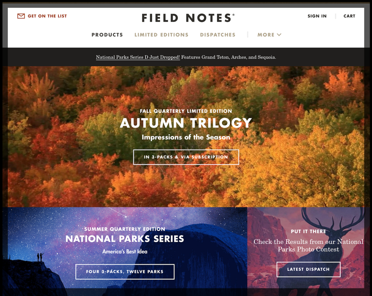
Is it product centric, like you see here on the Field Notes website?
If so, you’ll need beautiful photography or art that really highlights the benefits of your product(s).
Of course, this is only one option. You may be in an industry where it’s important to connect with visitors with people-centric imagery, or some other solution that is alignment with your organization and its goals.
Regardless, a shot list can help you define exactly what type of imagery will adorn each page — and in doing so it helps clarify the image creation process. With a completed, well thought out shot list, you will be able to give your photographer or graphic artist a MUCH clearer idea of what you’re looking for.
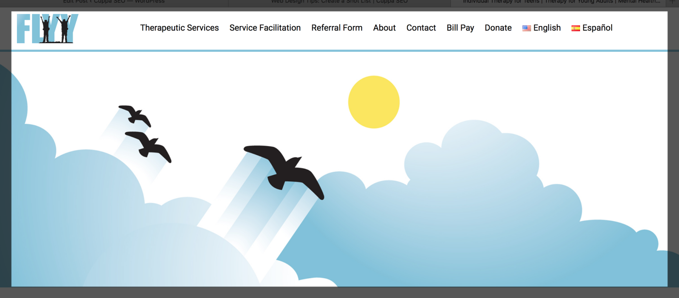
For instance, one of our long-term clients is an organization called FLYY, which is an acronym for Forward Learning Youth & Young Adults. FLYY didn’t want their website to come across as just another mental health organization. Because of this, we decided to use original art created by our very own graphic designer, Hannah, that would be metaphorical in nature — alluding to flight, which of course is the purpose of using the acronym “FLYY” in the first place.
Here’s a screenshot of the homepage hero image:
It was the shot list that helped us clearly define, and understand, the direction we wanted to go with regarding website imagery.
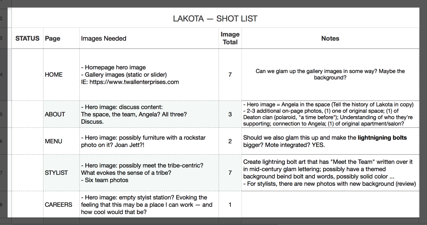
Here’s a sample shot list that we created in Google Sheets. This is an important consideration, as Google Sheets allows all invested parties to contribute and make notes in the shot list — all in one central place.
In this example there are lots of notes to help clarify next steps in the process. In case you’re wondering, this is an actual shot list for a client who owns a very cool hair salon in the south. The salon has a friendly, “mid-century glam” vibe, and that’s what we’re looking to bring to the website aesthetic.
As you can see, creating a shot list is an important component of the web design process.
Want more tips and insights from Cuppa SEO?


