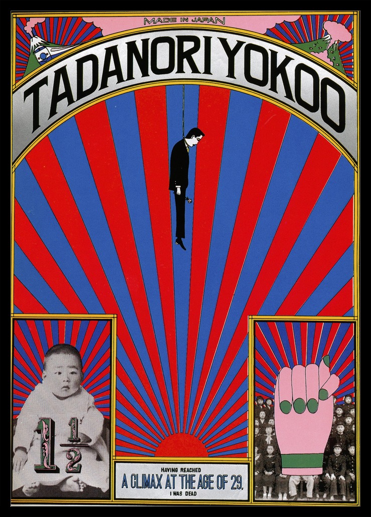
 What’s the first thing you see when you look at the image in this blog post? I’ll bet it’s one of four things:
- The Tandanori Yokoo headline
- The man displayed over the rays
- The baby in the lower left corner
- Or the hand in the lower right
This piece of art was created by graphic designer Tadanori Yokoo in 1965. Although this piece, and much of Tadanori’s work, is known for the layering of red rays into culturally charged art, it’s also an excellent example of how graphic design can control the eye of the viewer.
How Tadanori’s Art Relates to Conversion on Your Website
When it comes to web design and conversion, there are best practices that we often look to follow. These best practices are based on testing that has determined where a viewer’s eye is naturally attracted to on a web page. But just because something is a best practice, doesn’t mean it’s your only option — or the BEST option for your website. In this blog post, we’ll be focusing on graphic design and conversion strategies for a homepage. But first, a quick definition …
What is Conversion?
Conversion is a strategy that takes a website visitor from where they are, to where you want them to go. For example, a visitor lands on your homepage, and you want them to call to make an appointment (let’s say you’re a dental office). Conversion occurs when the viewer clicks on the “Call Now” button (on their smart phone) or dials the number they see on their desktop. The button and the phone number are typically referred to as a call-to-action (CTA) — a visual cue that helps move the viewer along to where you want to them to go.
But in order to be found, the CTA can’t just go anywhere — it needs to be seen, which is where best practices for conversion come into play.
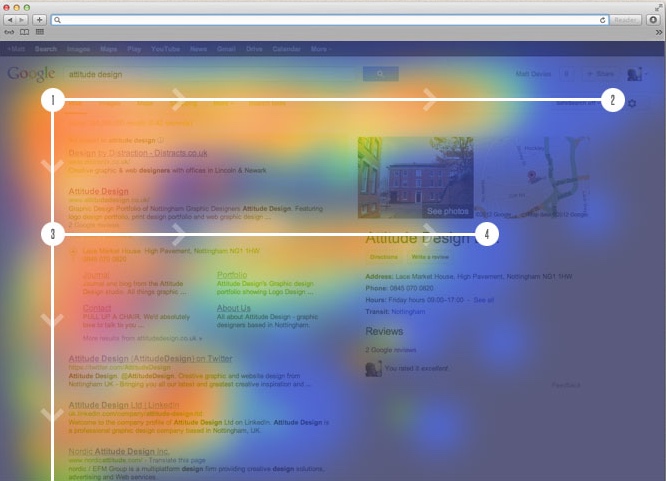
The “F-Zone”
The sketch below identifies the hot spots of a web page. In other words, areas where the human eye is naturally drawn to. These are the areas we typically want to place our important information, in this case, the call-to-action.
The Alternative to the F-Zone
What Tadanori’s art shows us is that through the use of aesthetic, we can break the rules here, and instead of depending on the eyes natural tendencies, actually direct they eyes to where we want them to go — keeping the level of conversion high and ensuring an excellent user experience.
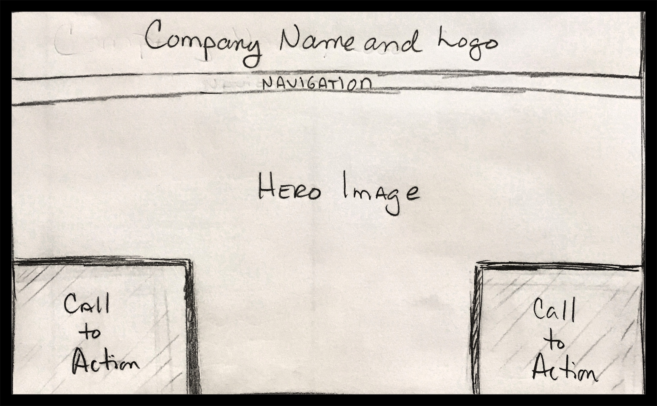
Here’s an example of how Tadanori’s image can be translated into a desktop homepage, with all of the important elements appearing above the fold:
As you can see, the bottom right element is completely out of the F-Zone, but is easy to spot and still catches the eye.
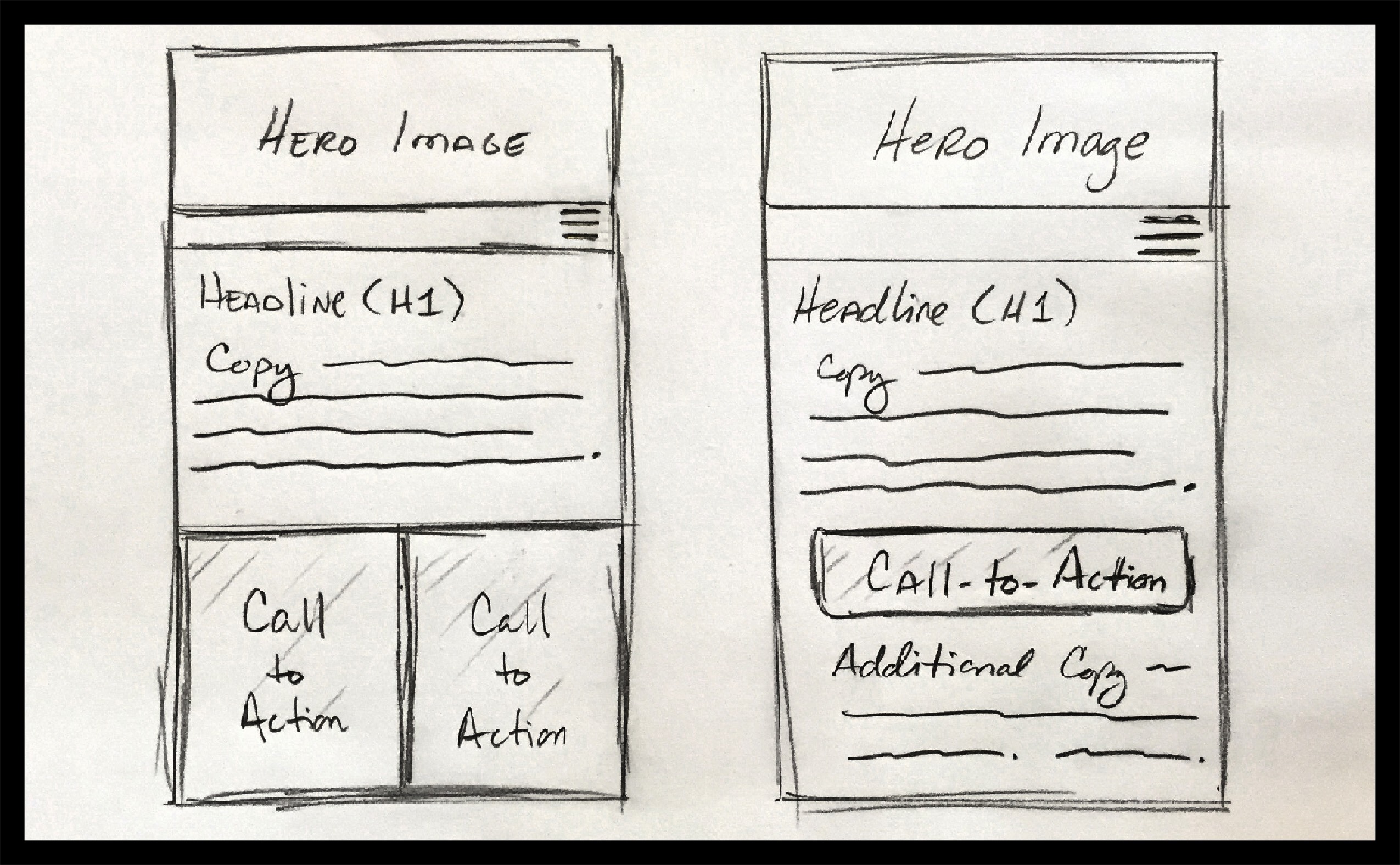
Here’s an example as to how it can be further manipulated to be effective on a mobile device. Since the F-Zone doesn’t come into play on mobile as it does on desktop, there’s a different set of best practices. The sketch on the left is a Tadanori-centric solution vs. the image on the right which offers a more traditional solution for solid conversion. The modified design still works, and actually fits quite nicely into the typical best practices for conversion on mobile — in this case with two clear call-to-actions visible without the need to scroll.
In addition to delivering a solid conversion strategy, keeping desktop and mobile design elements in mind WHILE creating a website offers additional perks, including:
- An excellent overall user experience (UX)
- A high level of continuity between desktop and mobile aesthetic, which helps you position your brand in a cohesive way
We hope these concepts help you think differently about your conversion strategies and the design elements of our homepage.
Need help with conversion strategies?
Contact Cuppa SEO to schedule a complimentary consultation, very possibly over a cup of coffee!


