 In Part 1 and Part 2 of this series, we looked at optimizing your Facebook Business page for better SEO.
Next, let’s look at some ways you can positively affect the user experience (UX) and website conversion on your Facebook Business page.
CREATING A SOLID UX
The more thoroughly you populate your Facebook Business page with accurate, relevant, benefit driven customer-centric content and imagery, the better the user experience will be.
When someone arrives on your Facebook Business page, you want them to see original imagery on your Home tab (it at all possible) that represents the essence of who you are as a business (no cheesy stock photos!). Choose engaging imagery that makes people feel at home and comfortable (this helps build trust), instead of imagery that is devoid of humanity.
Taking the time to ensure the content on your Services and About section is consistent, clear and customer-centric will go a long way in upping engagement with viewers. The result? Better UX.
If you’re not quite sure if your imagery and content is fitting these criteria, ASK some of your customers, colleagues or some trusted friends (who will not just placate you) what they think. After all, your Facebook Business page — like anything else in online marketing, business and life — is a test. The more you test, the easier it is to determine whether something works, kind of works, or is a complete dud. Without intentional testing, and recalculation, how can you ever expect to improve?
Whether or not you can help their organization is typically not the first question your visitor will ask. Some of the first questions (asked consciously or unconsciously) will be, “do I like them,” and “do I trust them.” If the answer to these is no, why would they want your help? This is why UX is so critical to the overall success of your online marketing, and the health of your brand.
UX AND YOUR FACEBOOK BUSINESS PAGE HIERARCHY
Facebook understands that every business is different. That’s why they’ve given us some choices as to where each of our Facebook Business page elements (like Posts, Videos, Photos, etc.) show up when a visitor stops by.
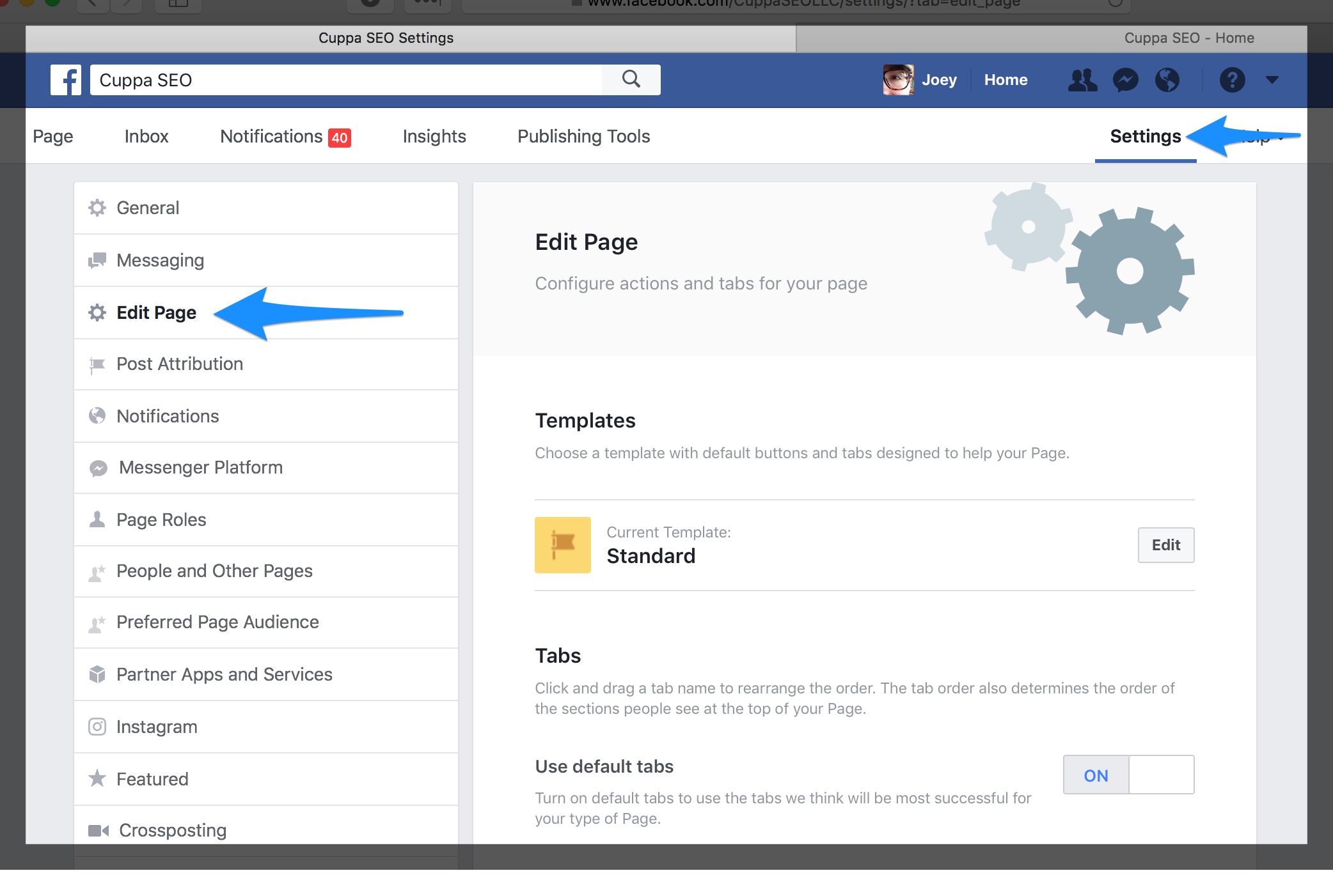
In order to edit your page hierarchy, and aesthetic, simply go to Settings, and click on Edit Page on the left-hand nav.
As you can see, near the middle of our Edit Page example is a Templates section where you can choose from templates built for Services, Business, Venues, and more. It will take a little time to determine which of these templates is actually best for your business. And once you do, you’ll then need to determine the best order for your Tabs, and if there are any you need to get rid of.
For instance, I currently use the Services template, but needed to turn off “Use default tabs” (near the bottom of our Edit Page example) so I could re-order the tabs for a better UX, AND remove Tabs like “Shop” and “Offers,” as they’re not relevant at this time for my business. Since this book is in your hands (or on your electronic device), this has probably changed as I’m going to want my visitors to buy my book! This ability to customize my Facebook Business page is an opportunity to ensure the best user experience possible for the visitor.
CONVERSION ON YOUR FACEBOOK BUSINESS PAGE
With a solid UX in place, you up your chances for conversion in two ways. First an attractive UX means a visitor is more likely to stick around. And the more they stick around, the better the possibility of them checking out one of your posts and clicking on whatever call-to-action it includes (we’ll look at this more later when we talk about Facebook Business posts). later).
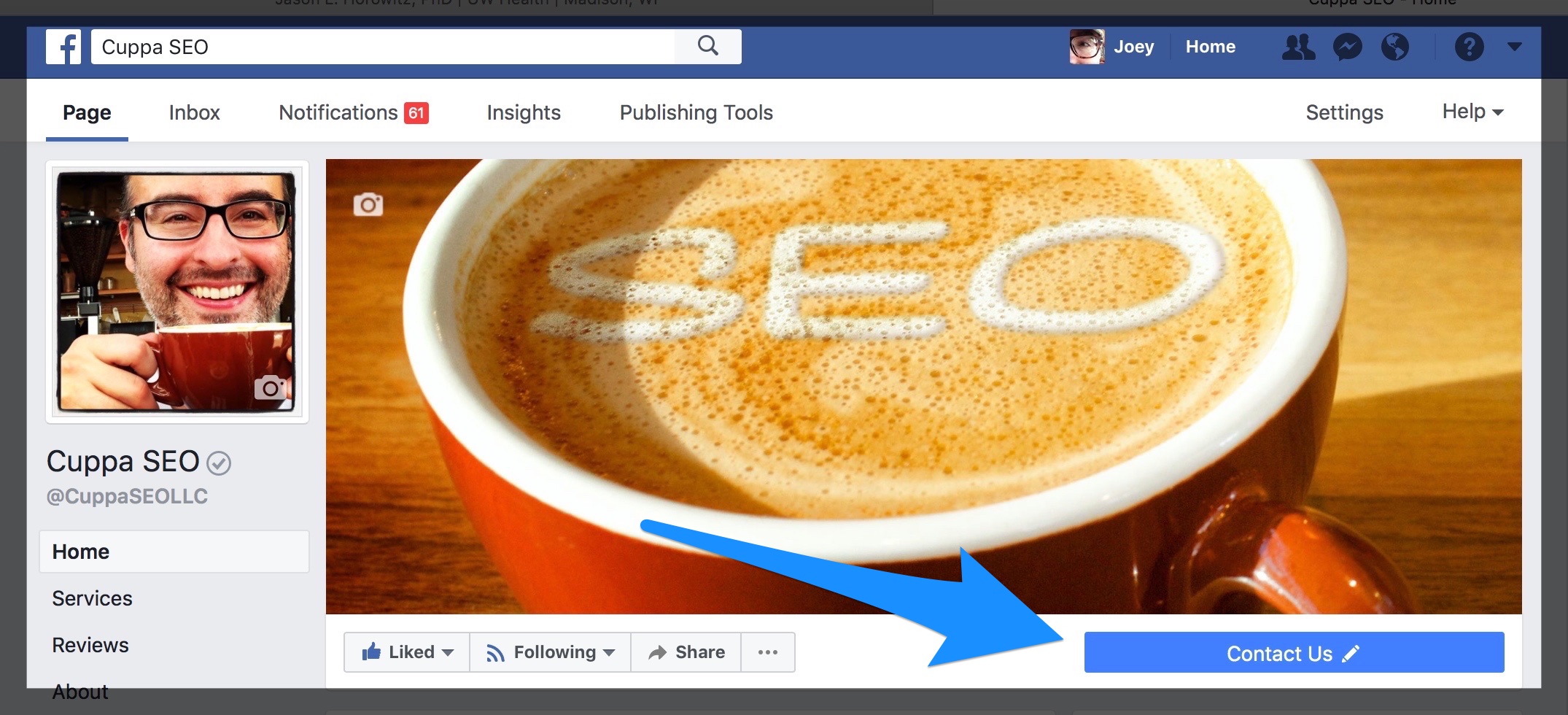
Second, and directly relevant to your Facebook Business page, is the call-to-action button Facebook makes available. Here’s what mine looks like …
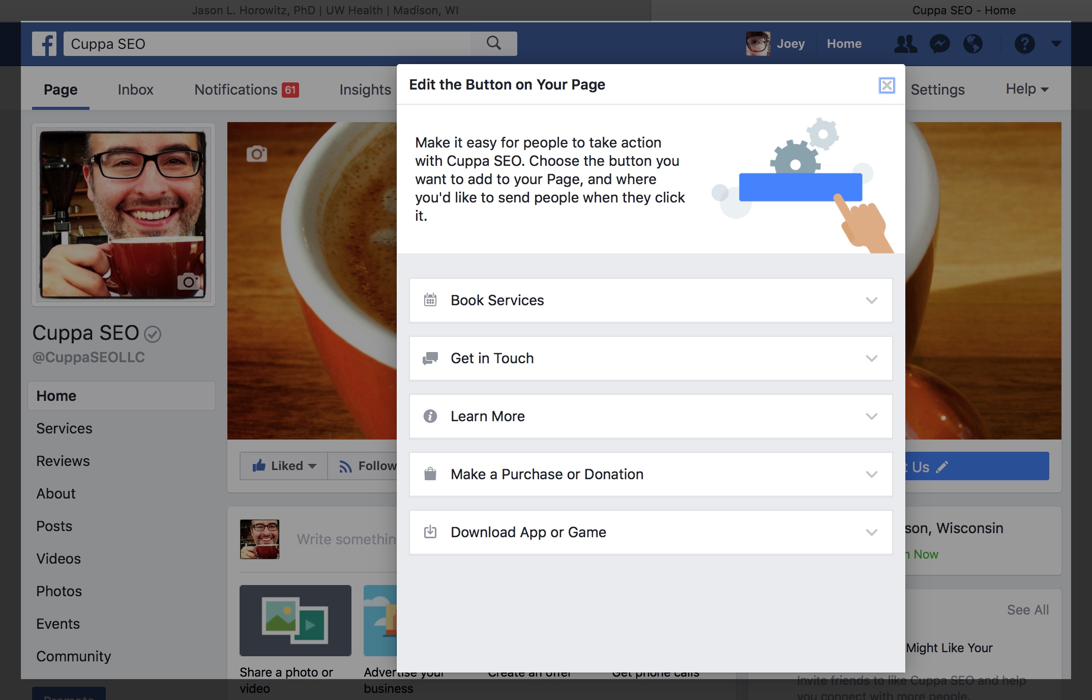
In addition to “Contact Us,” Facebook gives you a handful of categories and options to suite your business type:
Each of the top-level categories gives you options on button language, and where the button links to. Once your button is live for a few months, you can check analytics to see how many people have clicked on it. If your conversion rate is low, or non-existent, you can change the language/intention of the button, as well as where it leads to.
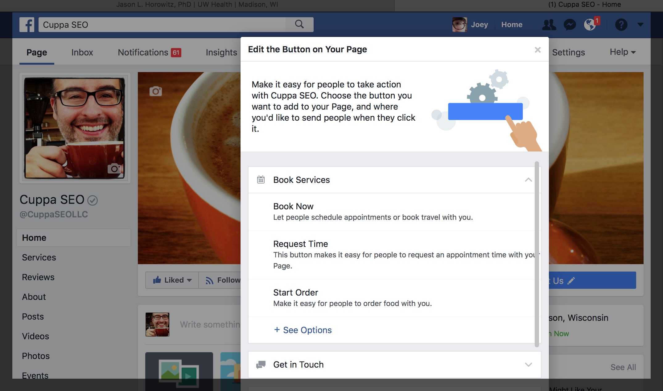
Here’s an example of the options that live under the Book Services category:
Just as we discussed with your website conversion, your conversion strategy here is to have visitors take the next step YOU want them to take. So, choose wisely …
