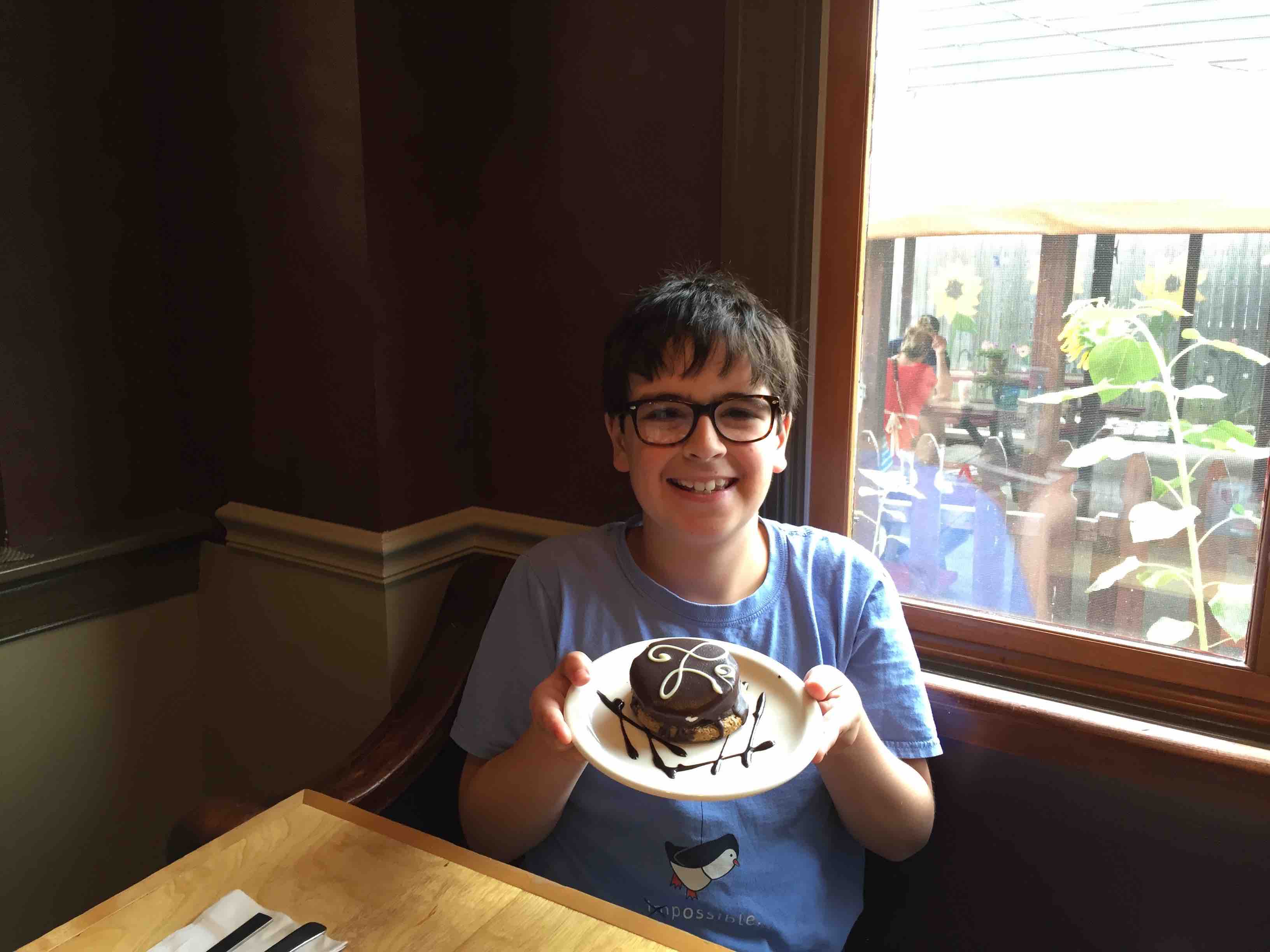
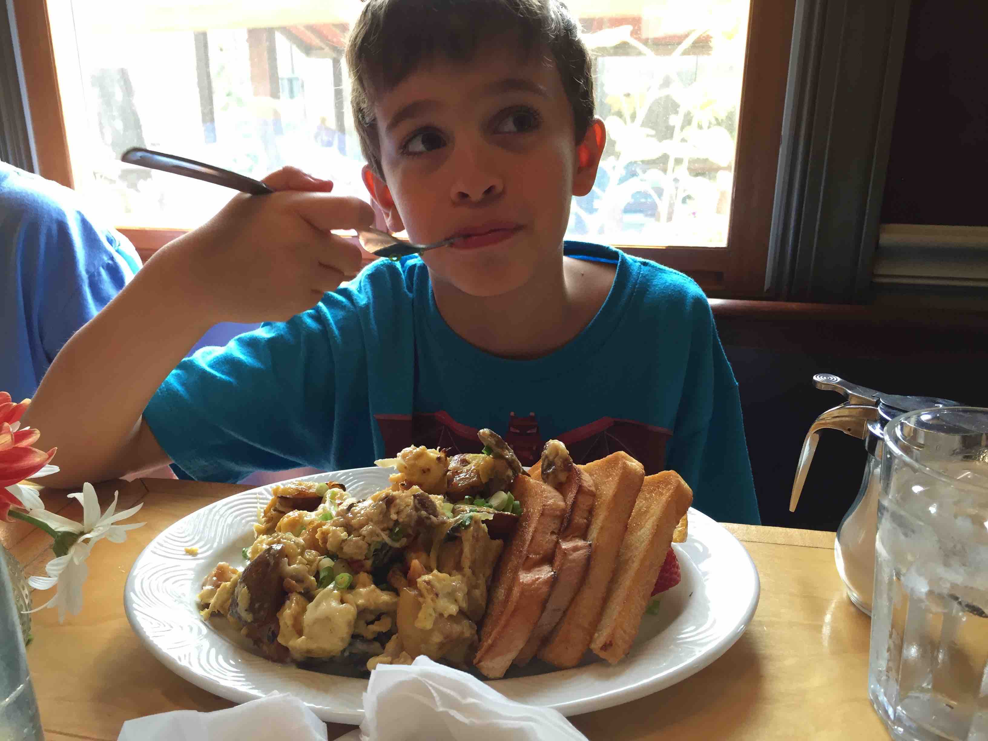
 After our first stop at the Hilton Gardens in Cleveland, OH, came Lucky’s Cafe.
Lucky’s was actually the reason we were in Cleveland to begin with, as we were on a Guy Fieiri (Diners, Drive-Ins & Dives) road trip as we made our way to New York.
As you may have guessed, I’ll be talking about the analog user experience (AUX) that my boys and I had while visiting the cafe (my wife had flown to NY a few days earlier, so it was just us boys).
Lucky’s had a lot going for it.
Here’s a partial list, put together by myself and my sons, Max and Joss, that details our analog user experience:
- Before we even walked in, the aesthetic of the building & the outside dining area were impressive & inviting.
- Inside, the beautiful aesthetic continued, with a clean, fresh & rustic design that was warm & homey — from color palette to furniture & overall decor — well designed.
- A treats counter with delicious-looking goodies.
- The wait staff was friendly, informative, authentic & compassionate (I have some dietary restrictions that they were extremely willing to cater to without any hassle).
- The food was made from scratch, literally — no shipping in bread or jam, or the goodies in the treats counter … they make it all themselves (and it was really good)!
- Lucky’s has great relationships in the Cleveland community, partnering with farmers, butchers, etc, who provide them with local ingredients.
- The menu was minimalist, yet mouth watering — making it clear and easy to determine what my options were.
- The food was awesome — fresh, delicious & beautifully plated.
*Note: that’s the waitress in the middle photo, not my wife.
My son Joss gave Lucky’s Cafe a 5 out of 5 for analog user experience. Although I think next time, he’d rather fly than drive to get there.
How this Relates to Your Website
In each installment of our analog user experience series we’ll look at ways our real-world experiences relate to the online user experience, in an effort to help you assess where your website is at.
Aesthetic
The exterior of Lucky’s is like the homepage on your website. Before anybody sees what’s inside, there’s a good chance they’ll land on your homepage first, and it needs to impress. The same can be said about your subpages, which is like the inside of Lucky’s. If your subpages are confusing, bland or hard to navigate your user experience score will plummet.
Content
The food at Lucky’s was made by them from scratch. The same needs to be true of your website content. It needs to be original, created from scratch by you (or a professional writer like me) so it’s unique and relevant. Of course it should also be optimized with SEO in every nook-and-cranny.
The freshness factor heavily comes into play with your blog, which is the easiest way to continually integrate fresh content into your website. In a way, it’s like the treat counter at Lucky’s because fresh content is as appealing to Google’s algorithm as fresh pastries are to human tastebuds.
Conversion
To achieve high conversion on your website, your call to action needs to be clear. Notice that I said “call to action,” not “calls to action.” Too often, websites offer way too many calls to action to customers, when they should only be providing one or two. Lucky’s menu is the perfect metaphorical example of a successful call to action. It’s clear, easy to understand and it wasn’t eight pages long like the menus we’ve all had to fumble through at a diner. When we offer only one or two calls to action, we wind up providing a better user experience, and in turn have a greater chance of having the customer take that action.
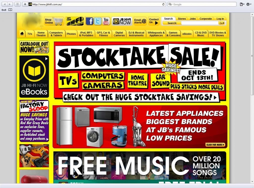
In other words, avoid this …
And if you’re ever in Cleveland, OH, be sure to visit Lucky’s Cafe!
