 During the last week of summer, my family and I took a road trip to New York. On the way we stopped in some interesting places, and in addition to spending lots of time with my kids and wife, the trip also offered a variety of observations in real-world user experience — or what I like to call analog user experience (AUX).
You might be wondering why a company that specializes in web design, blogging and search engine optimization would be talking about analog user experience. The reason is simple: the core principal of both analog and digital user experience is the same …
… to give each person who visits the very best experience possible.
In this series, we’ll be exploring mini-case studies in AUX that can be applied to your business and your website.
Let’s begin with the first hotel we stayed at on our way to NYC — the Hilton Gardens in Cleveland, Ohio.
On the trip to NY, it was just me and the boys (my wife flew out ahead of us) and we were exhausted from a long day of driving.
When we arrived at the hotel, I was informed that I’d be billed $16 for on-stie parking. Not a big deal, but a surprise all the same.
Our room contained many unique attributes that I had not experienced in a hotel before, including:
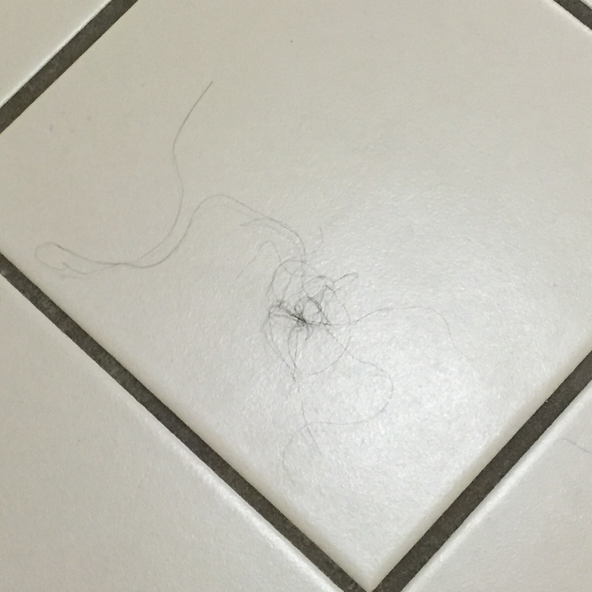
– A huge hairball on the bathroom floor
– A rickety toilet that teetered side to side
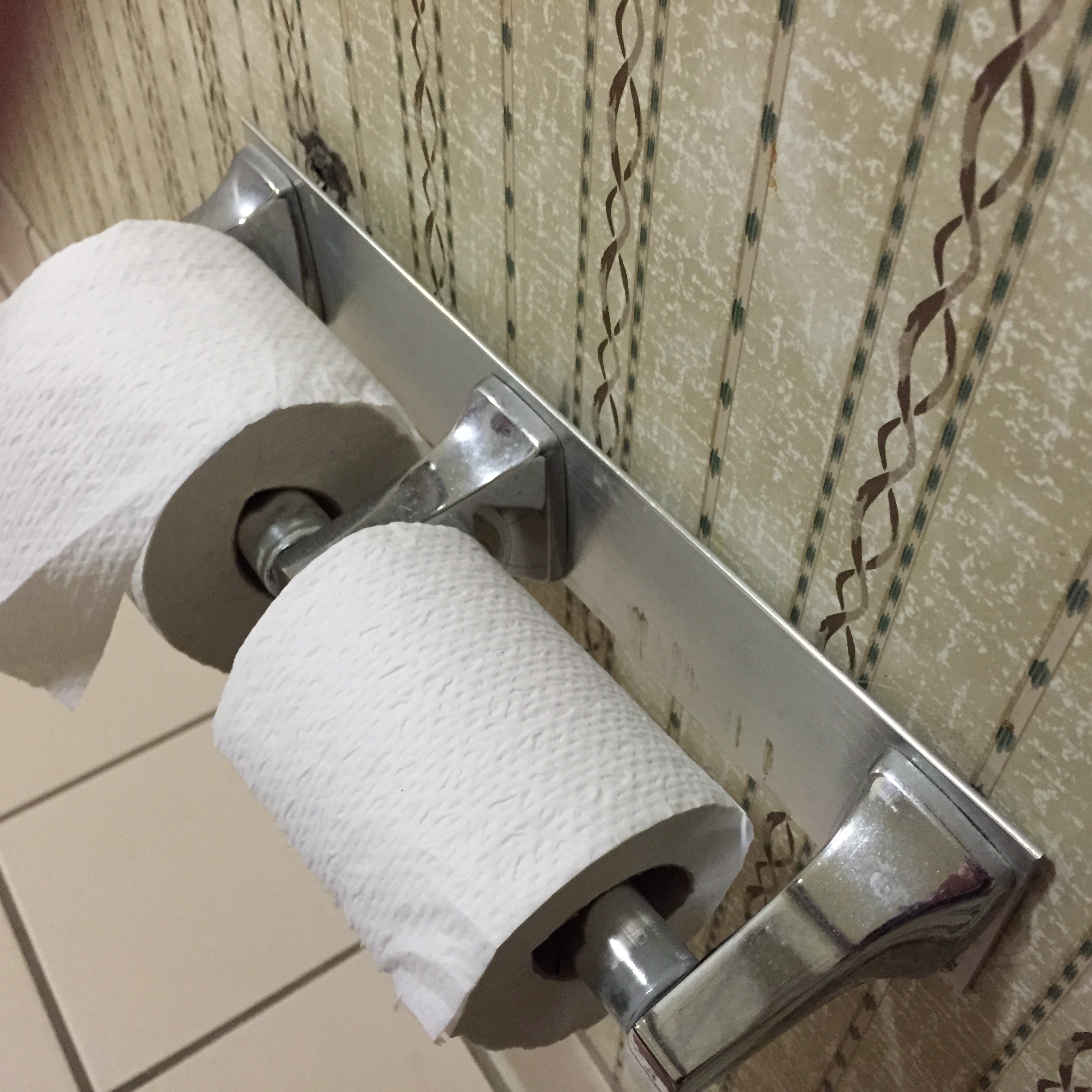
– A rusty toilet paper holder that was half detached from the wall
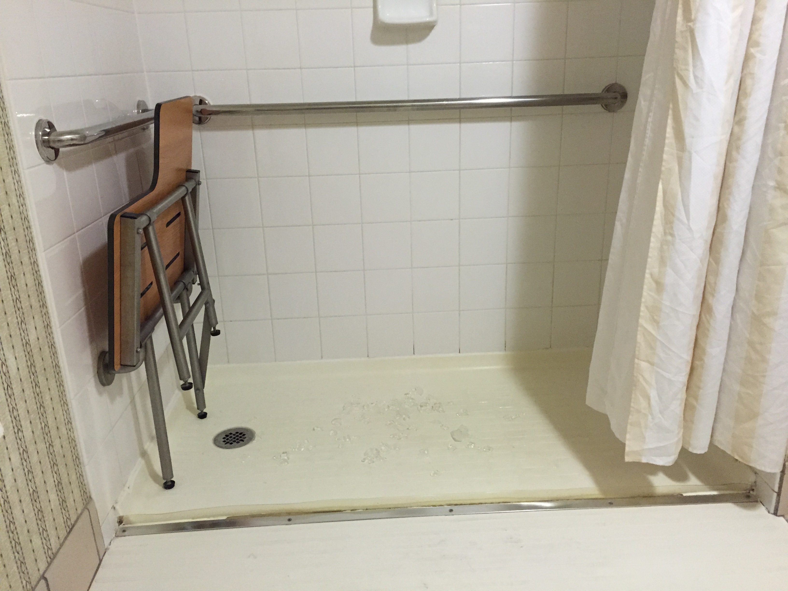
– An ancient looking shower that was built with absolutely NO design sense


In addition, none of the vending machines had water in them and the jacuzzi (which my kids love for some reason) was not clean.
Overall, my 9-year old son Joss gave this hotel 1.5 out of 5 stars.
The hotel’s branding clearly states, “welcome to the Hilton Garden Inn, home of the EXCELLENT stay. Excellence drives us!”
There was nothing excellent about our stay, other than the relief we felt after we left the hotel. The user experience was horrible.
How this Relates to Your Website
Is your website suffering from the same kinds of issues this hotel presented? Do you have broken links or missing images? Maybe the information on your site is outdated, or your website is suffering from an old design that’s no longer appealing to the eye. Or, maybe your navigation is confusing. Issues like these could cause a poor user experience, and in turn cost your company revenue.
Even if your site is functioning properly, it doesn’t mean your users like it. At the end of the day, the hotel room still performed it’s function, but it did so in a way that made us never want to go there again.
Make sure your website isn’t being perceived as a yucky hair ball. Instead, make it something appealing that people WANT to visit again.