 Have you done much thinking about the user experience (UX) of doors? Unless you’re a UX expert, probably not.
That said, have you ever walked up to a door and pushed (or pulled) — and the door didn’t budge? I’m guessing yes. This poor user experience is the result of a poorly designed door.
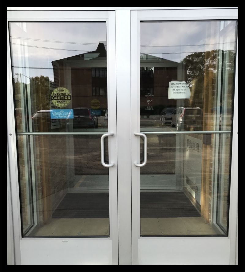
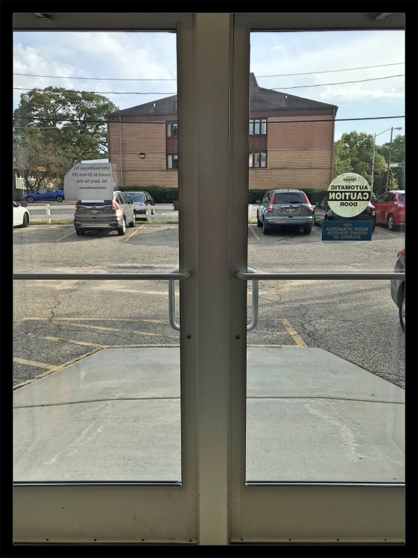
The reason I bring this up is the other day I was entering a building after an appointment and I encountered some really good doors!
Before we go any further, let’s quickly define user experience so we’re all on the same page …
User experience is the positive, negative or neutral experience you have online or in the real world (what I like to call the analog world). It’s as simple as that!
From the instant I looked at them, I could tell these doors were well designed because I didn’t have to think about how to use them.
To enter the building, the vertical bars made it clear that the door needed to be pulled to be opened …
To leave the building, the horizontal bars clearly communicated they were to be pushed …
Now, this may not seem like a big deal, but if both sides of the door had ONLY horizontal bars or ONLY vertical bars, then the clarity of how to use the door is lost.
What this has to do with web design …
Well, a lot, actually.
When someone arrives on your website, you want things to be as clear and easy to understand as possible. Is it easy to find your products or services? How about ways to get in touch? Do you have one or two calls-to-action on your homepage, or do you have dozens like this one?
If you’re interested in geeky stuff like this, check out The Design of Everyday Things, by Don Norman. It’s chock-full of examples of products that have positive and negative user experiences.
Want more tips and insights from Cuppa SEO?


