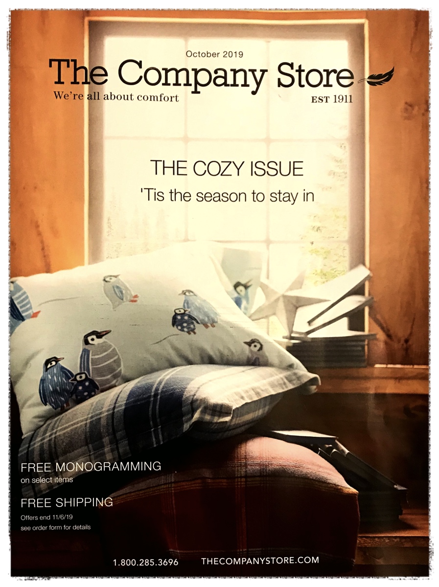
 The other day I received a catalog from The Company Store, and what did I see on the cover?
Penguins.
This was kind of a big deal because my wife and I have been Penguin fans for years. So, I thought it might be cool to get a set of sheets and pillowcases for our home, but …
… although the pillowcase was prominently featured on the cover — no page number was given. This is one of the most pervasive problems I’ve found in the world of catalogs, and it’s just a plain bad user experience (UX).
What is the reasoning behind not making it super easy for a potential customer to find what what you’ve presented to them on the cover? Maybe it’s so they’ll peruse the entire catalog and buy more, or maybe it’s just an oversight. Who knows
What I do know is, regardless of the reasoning, it’s still a bad UX. In my case I went from being excited to make a purchase (the reason for the catalog’s existence in the first place) to being mildly annoyed that this company was providing a bad experience.
So, instead of spending money, I decided to write this blog post about it.
What this has to do with web design …
Whether it’s a catalog, or a website, it’s got to be easy for people to find what they want! They should never have to dig around searching, hoping they stumble upon what they’re looking for. This is true whether you have a handful of products/services, or thousands of products like J. Crew does.
J. Crew has taken an immense amount of product and made it easy to drill down to exactly what you want.
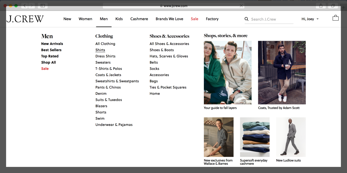
Here’s J. Crew’s mega navigation: lots to choose from, yet precisely organized for ease of use …
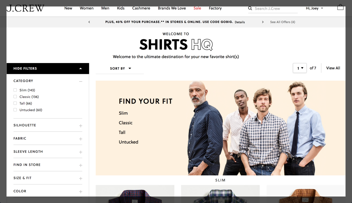
And here’s what it looks like once you choose a category to peruse. The left-hand navigation on this page makes it easy to make choices that further sharpen results — all at a glance.
Now, imagine if J. Crew had taken the standpoint of the catalog cover with no page numbers. You’d have to scroll through ALL 341 items of their Shirt category to find what you’re looking for.
When it comes do web design, remember to make the user experience customer centric!
Want more tips and insights from Cuppa SEO?


