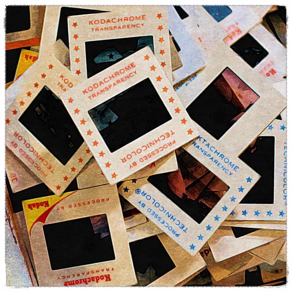
 Slideshows are a commonplace strategy for sharing more information through a series of sliding imagery/offers on a homepage.
We’ve all seen them. Each slide sits front and center for a few seconds, and then it’s gone.
Avoid this strategy on your website, as it’s bad for conversion.
Website conversion is a strategy that takes a website visitor from where they are, to where you want them to go.
When we offer too many options for where we want to lead people, it causes them to think. And although thinking is usually a good thing, we want to avoid unnecessary brain work on our website because it can easily lower the user experience. And when the user experience is damaged, conversion can often be a casualty.
To avoid bombarding visitors with offers, you can ask yourself one simple question: what are the top one or two things we want a website visitor to do?
This is not always easy to answer, especially if you sell a lot of products or services.
If this is the case, it’s good to employ the 80/20 rule. What 20% of your products or services account for 80% of your business? if you’ve got a lot of services/products, then identify the top performing product or services categories, instead.
Write them down.
Essentially, the goal is to pare down your top products/services to 2 or 3, and then create a strategy to present them on your homepage in a way that avoids slideshows.
This is not always easy, but it’s been proven that providing less options, in a clear and easy to digest way, helps improve conversion rates. And that means more people buying product, or scheduling a consultation to discuss your services.
Think of it this way. Which is easier to digest and remember?
- My name is Joey and I run a web design firm
OR … - My name is Joey Donovan Guido, and I’m originally from New York. I have two kids, a cat, and a beautiful wife. I run a web design firm that specializes in SEO, UX, conversion and Adwords, and I’ve been blogging for over 10 years. I like Apple products and mid-century modern design.
As you can see, the more information presented, the more difficult it is to retain, and the less clear my message becomes.
Want more tips and insights from Cuppa SEO?
