 User experience (UX) is something that occurs during every interaction you have with customers and potential customers — both online and in the “analog” world.
Often times, it’s the user experience that determines whether or not someone chooses your service, product, or signs up for one of your offers.
A large part of Cuppa SEO’s web design process focuses on the creation of a positive user experience on our clients’ websites — one that incorporates a solid conversion strategy.
In this post, we’ll review one of the best user experiences I’ve ever come across, provided by the Dollar Shave Club.
Let’s take a look at how their website, and their email campaigns, provide an incredible user experience, while creating an environment that supports high conversion.
Dollar Shave’s Website UX
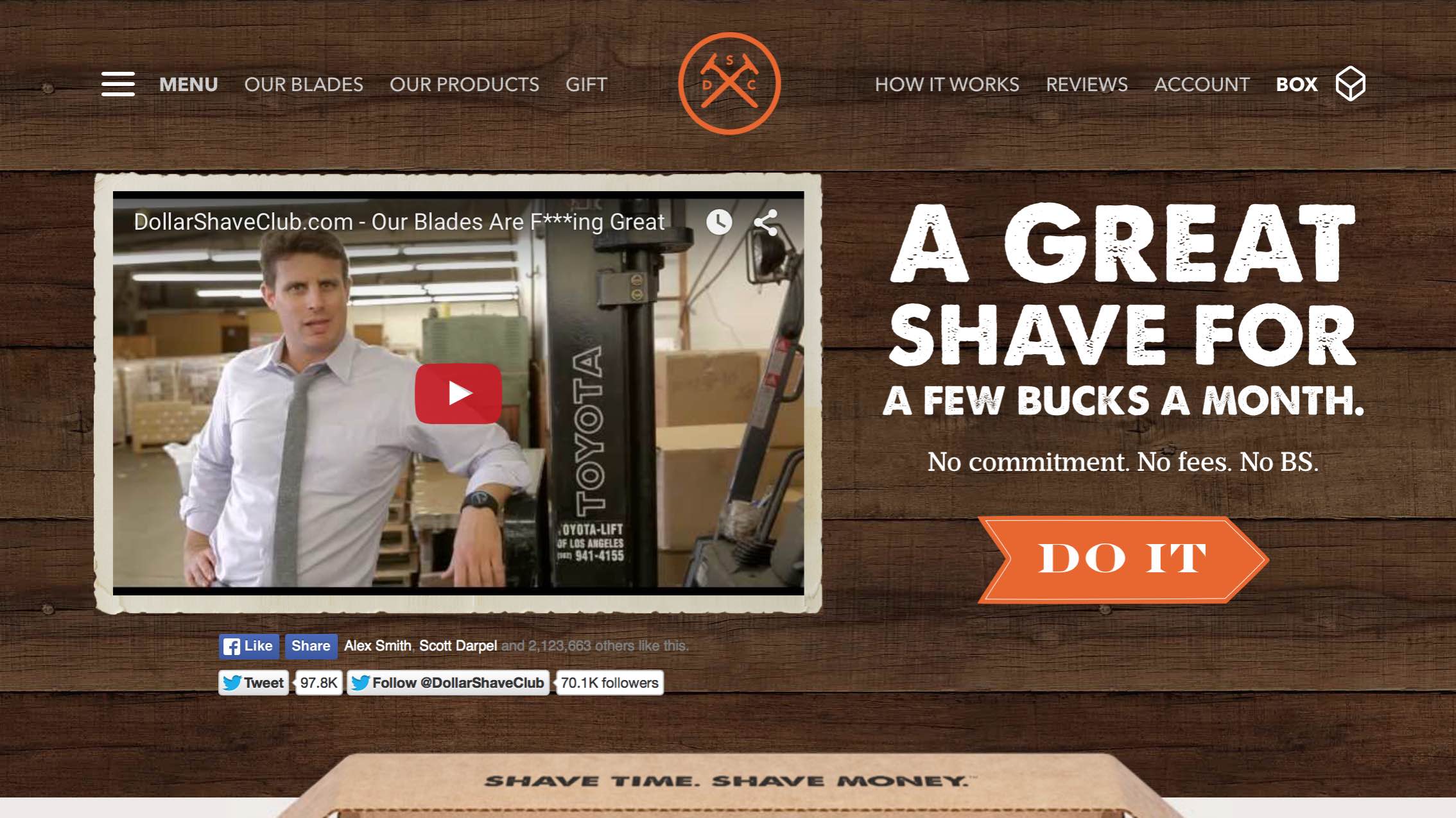
The Dollar Shave Club website is clean, clear and well designed.
When you arrive there, in less than 10 words they offer a their value proposision:
“A Great Shave for a Few Bucks a Month.”
There’s no need to think about it, in just a couple of seconds I know what the benefits are:
- A great shave
- … for much less than I’m paying now
Sure, there are more details and choices, but this is not the place for them. I’m either satisfied with my current shaving solution or I’m not. And even if I am, maybe I don’t like paying twenty bucks for blades every few weeks.
If either of these benefits sounds good to me (in my case, they both did), once again I don’t need to think — I just need to click on the “DO IT” button. Easy, pleasant and pain-free! Might their razors deliver the same value?
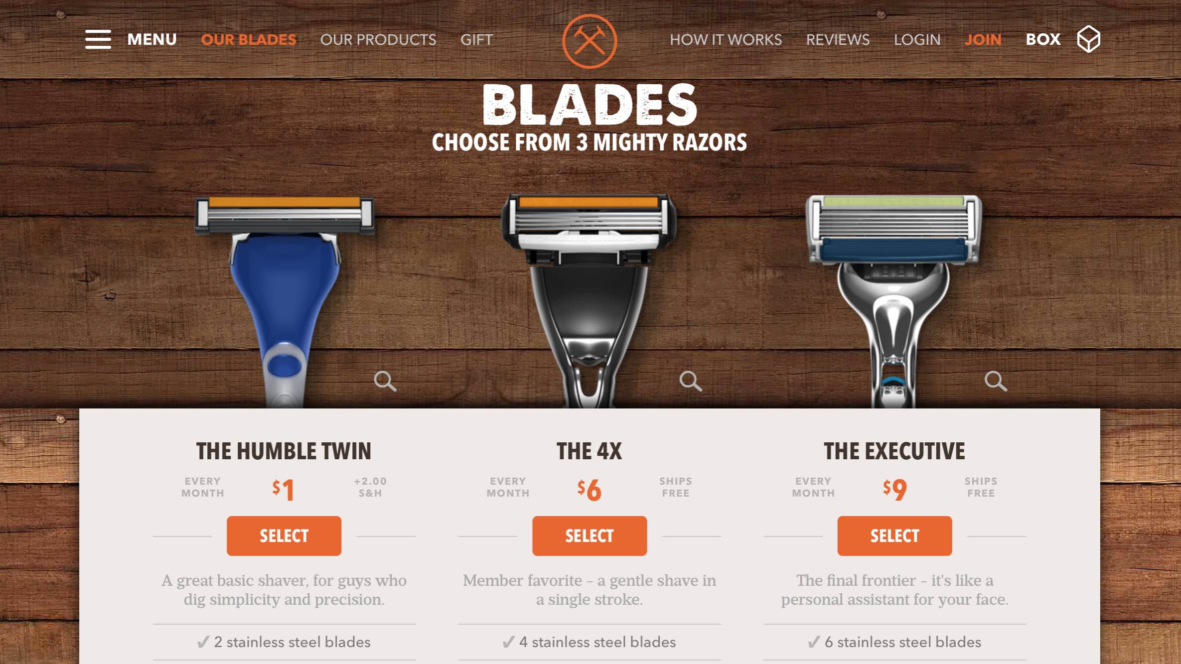
Once I click on “DO IT,” I arrive here …
I’m presented with three very clear choices. If you’re a man, you know there’s really no thinking involved in deciding between these three razors. Depending on the thickness of your beard, the choice is clear between the first and second option. And if you’re looking for a little luxury in your life? Go with choice three. Sure there are lots of details below each choice, which is great for customers who want to know more. But this is OPTIONAL. I don’t have to read it to make a decision. Once again, I can save my brainpower for other things like marketing my business and optimizing websites.
The website’s user experience remains just as pleasant throughout the entire product selection and checkout process. And once you’re a customer, the great UX continues …
Dollar Shave’s Email UX
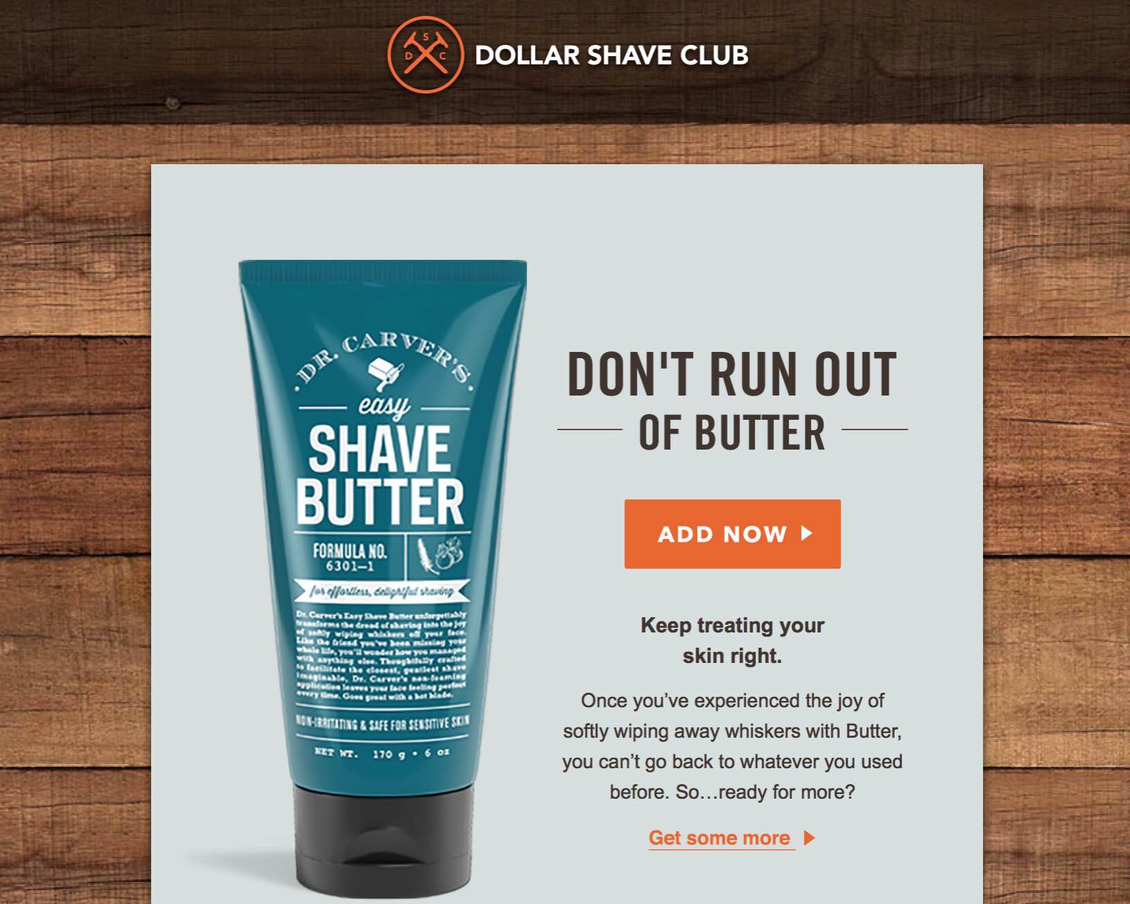
Dollar Shave does such a good job on their email campaigns that I actually look forward to hearing from them. Plus, they don’t jam my inbox with too many emails, which makes the one or two I receive per month more welcome.
Here’s a recent email I received that focused on a product I’ve ordered before.
Subject line: Stop. Buttertime.
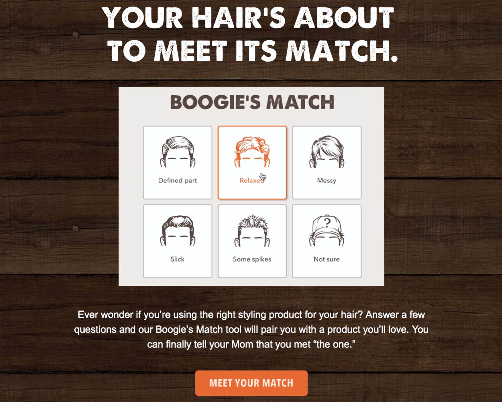
Here’s one for a product I haven’t tried. Subject line: The search for better hair is over.
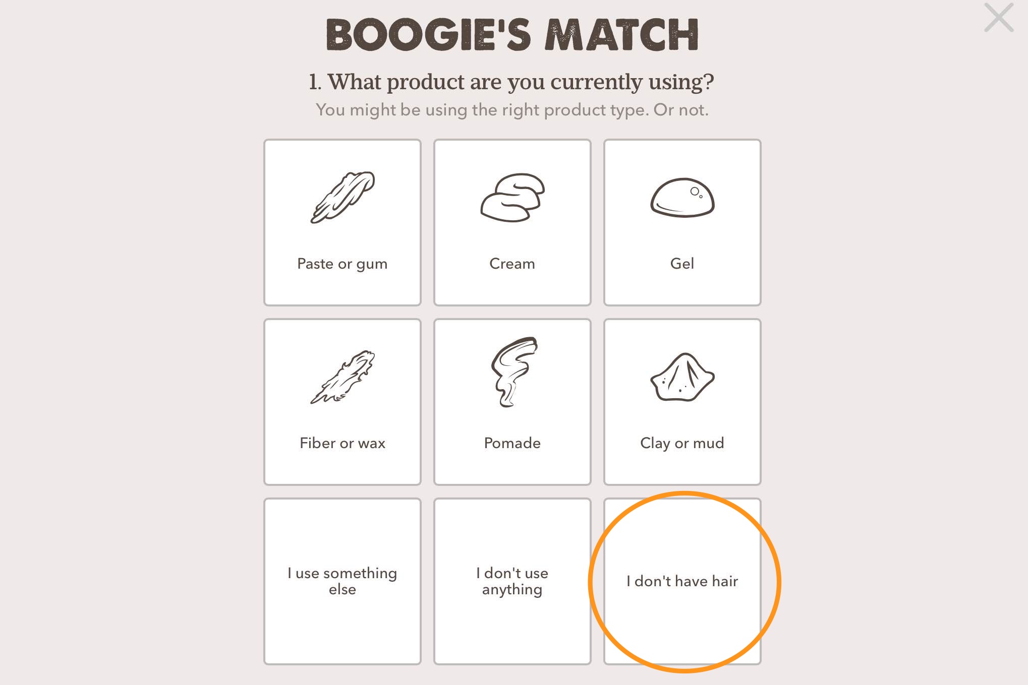
Unfortunately, even Dollar Shave’s great UX can’t change the fact that I don’t have a lot of hair on my head. But if you click on the “Meet Your Match Button,” you’ll find they have my demographic covered as well with a “I don’t have hair” option.
Throughout all of these initiatives, Dollar Shave Club provides an excellent user experience that’s also incredibly consistent. Their efforts are a brilliant example of how to effectively create a top-notch UX with a high-performing conversion strategy baked right in.
Need help with your UX or conversion?
Feel free to contact Cuppa SEO to set up a complimentary consultation!
